Appearance
Dashboard User Guide — The Dashboard View
The Dashboard view (/dashboard) is Coldwave's at-a-glance overview workspace. You compose a dashboard from widgets — small tiles that each show one slice of fleet state — and arrange them on a free-form grid. Multiple dashboards live side-by-side as tabs, and one can be marked as your home dashboard so it opens automatically after login.
This guide walks through the view area by area. Screenshots show a typical setup; your own widgets will look different but the controls are the same.
Contents
- Page layout
- Widget types
- Adding a widget
- Configuring a widget
- Arranging widgets
- Multiple dashboards (tabs)
- Home dashboard
- Welcome dashboard and warning widgets
- Persistence — what is remembered
1. Page layout
The dashboard is a free-form grid of widgets.
| Area | What lives there |
|---|---|
| Toolbar | Add Widget button, dashboard tab selector, home indicator. |
| Grid canvas | The widgets themselves, snapped to a 12-column grid with vertical compaction. |
| Widget | Each tile has a header (drag handle + menu), a body (the actual content) and an optional footer. |
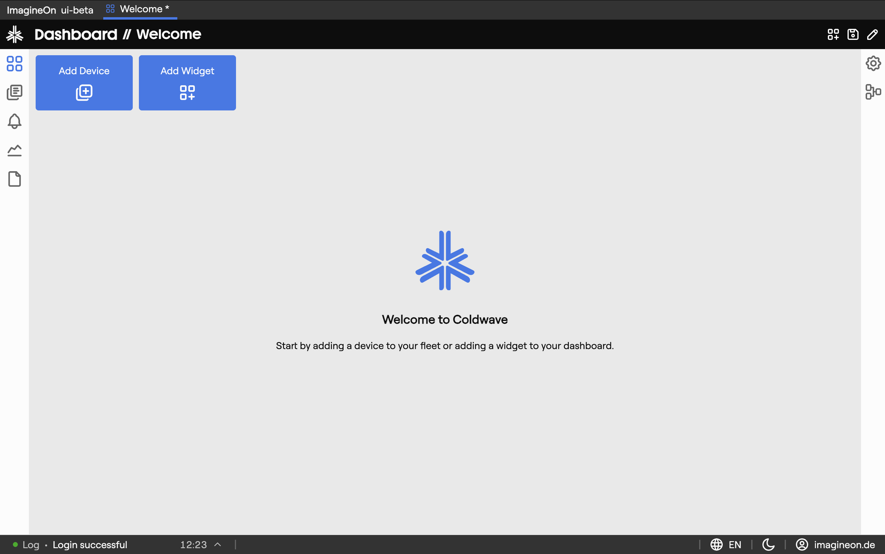
When you load a dashboard with no widgets, the canvas is empty and the toolbar is your only entry point.
2. Widget types
The widgets you can add depend on the permissions you have. Common types:
| Widget | What it shows |
|---|---|
| Property | A single property value from one device — with optional color, units and threshold styling. |
| Graph | A time-series chart of one or more properties on one device. |
| Online count | Fleet-wide tally of online vs. offline devices. |
| Online devices | List of devices and their online state. |
| Device overview | Compact card with the most important metadata for one device. |
| Alarm overview | Count and status of active alarms across the fleet. |
| Location map | Geo-map of devices, colored by online status. |
| Quick access | Shortcut panel for adding more widgets. |
If a widget type you're expecting isn't in the Add Widget modal, your role probably doesn't grant access to the data it would show. Talk to your administrator.
3. Adding a widget
Click Add Widget in the toolbar.
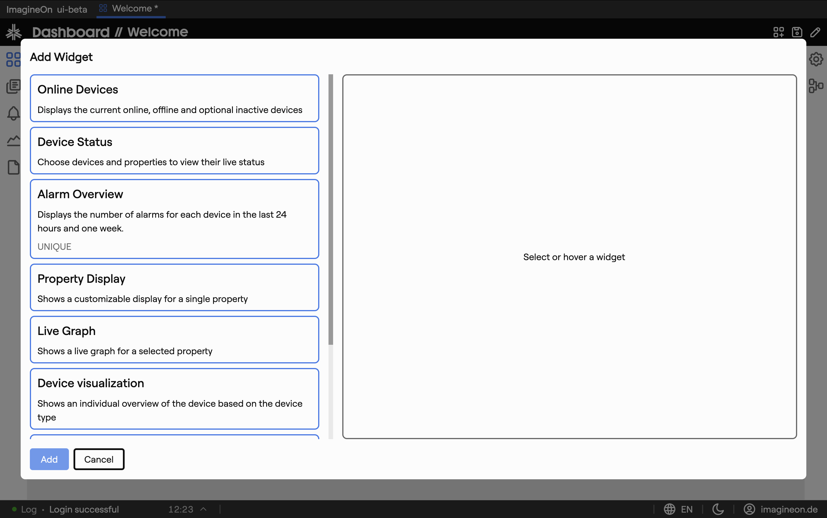
In the modal:
- Pick a widget type from the left-hand list.
- Configure it in the form on the right. Common controls: device multiselect, property multiselect, color picker, refresh interval, optional threshold values.
- A live preview of the widget renders as you change settings, so you can verify it before placing.
- Click Add to drop the widget onto the grid.
New widgets are automatically positioned in the first free space on the grid — no need to clear room first.
4. Configuring a widget
Open a widget's settings later by clicking its gear icon or via its header menu. The same modal opens — change any setting and click Save.
Each widget type has its own settings. Examples:
- Property widget — pick device + property, choose a display color, optionally a unit override, optionally a threshold to color the value red when crossed.
- Graph widget — pick device + properties + time range.
- Location map — pick which devices to plot.
There's also a per-widget Hide header toggle that removes the title bar for a cleaner look — useful for full-screen property displays on operator screens.
5. Arranging widgets
The grid is 12 columns wide and uses a 90-pixel row height. Widgets snap to that grid and re-flow upward when there's empty space below them.
- Move — drag a widget by its header to reposition it. Other widgets shift out of the way.
- Resize — hover near the bottom-right corner of a widget to reveal the resize handle, then drag.
- Remove — open the widget's header menu and choose Remove, or right-click → Remove.
Each widget has a minimum and maximum size — a property tile won't shrink to nothing, and a map won't expand to fill more than half the canvas. The constraints depend on the widget type.
6. Multiple dashboards (tabs)
You can keep several dashboards in parallel — for example one for "Plant A overview", one for "Critical alarms", one for "My on-call view". Each appears as a tab in the dashboard toolbar:
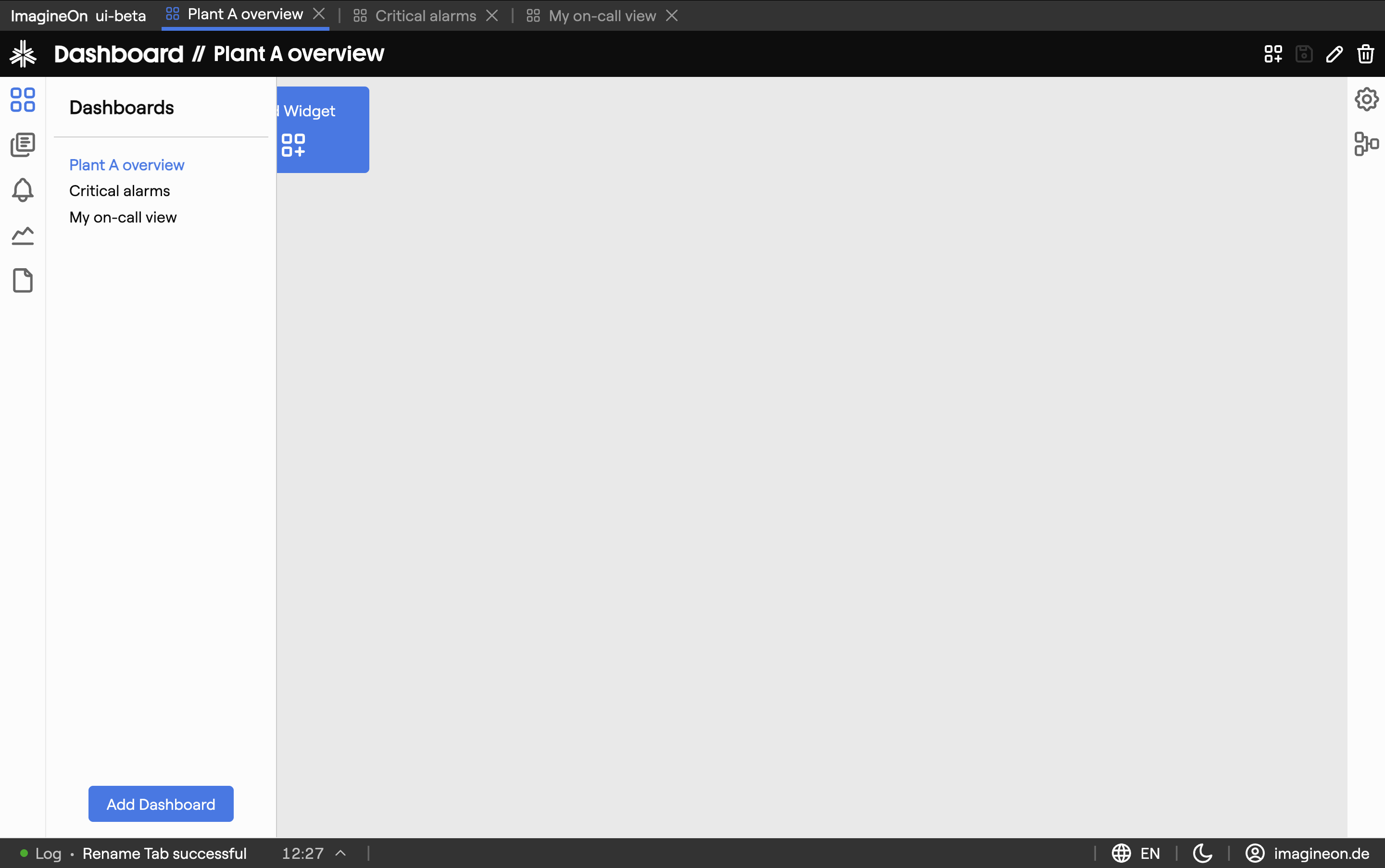
- Click a tab to switch to that dashboard.
- Create a new dashboard via the + at the end of the tab strip.
- Rename or delete via the tab's right-click menu.
Each dashboard remembers its own widgets and layout.
7. Home dashboard
One dashboard can be designated as your home dashboard — it's the one shown right after login and when you click the Coldwave logo. Mark a dashboard as home from its tab's menu; a small house icon marks the chosen tab.
8. Welcome dashboard and warning widgets
On a brand-new account with no dashboards configured, Coldwave creates a Welcome dashboard with a curated set of starter widgets, so you have something useful to look at on first login. Feel free to modify or delete it once you've built your own.
If your backend's configuration is incomplete (missing translations, alarm config, device metadata), small warning widgets appear automatically pointing at the gap — for example "Schema translations missing". You can't dismiss them by hand; they disappear once the underlying configuration is fixed.
9. Persistence — what is remembered
Per-user, persisted between sessions:
- All dashboards — names, order, which one is home.
- Widget list and layout per dashboard — what's on each, where it sits, how big it is.
- Per-widget settings — every configuration option you set in the widget editor.
Always fresh:
- Widget data — the values inside each widget reload on a configured interval (or on demand for some widget types).