Appearance
Analytics — Overview & Toolbar
The Analytics view (/graph) is Coldwave's time-series analytics workspace. It lets you load device properties and alarms onto a multi-axis chart, inspect them with crosshair tooltips, overlay thresholds and statistical bands, switch between chart / sparkline / table representations, and watch values arrive in real time via Live mode.
This page covers the page layout, toolbar and crosshair interaction. Two companion pages dive deeper:
- Analytics — Working with Data — adding properties, time ranges, axes, sparklines, table, overlays, state bands.
- Analytics — Sharing & Persistence — exporting, deep links, what's remembered.
Contents
1. Page layout
The Analytics view stacks two panels vertically, separated by a draggable splitter and a horizontal toolbar.
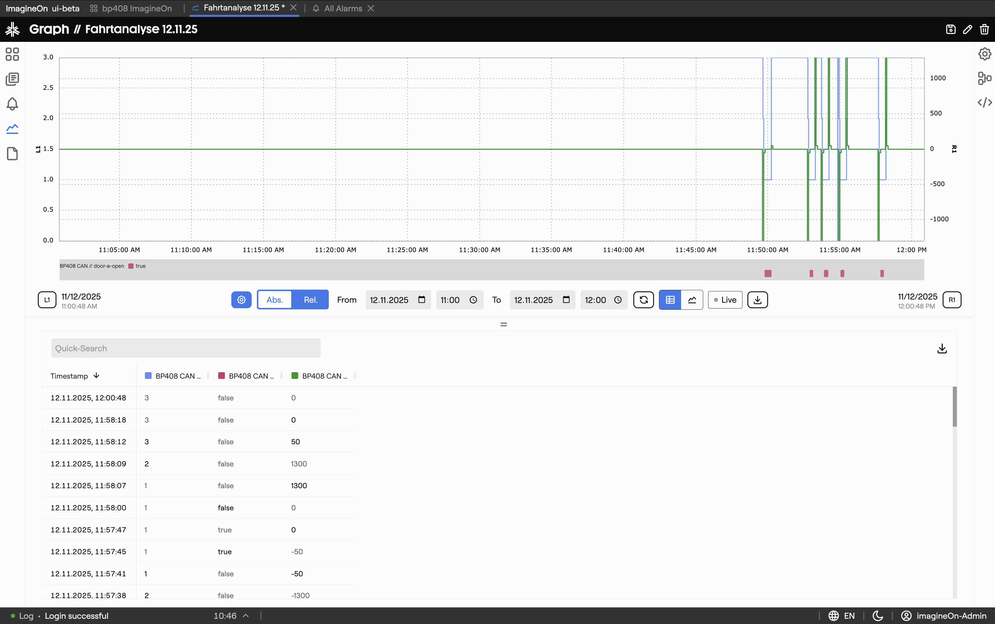
| Area | What lives there |
|---|---|
| Top panel | Main line chart, the colored state-band strip just below it, and the Y-axis labels on both sides. |
| Toolbar | The strip in the middle of the screen — axis edit buttons (L1/L2/…), time range controls, view-mode toggle, Live, Export. See §2. |
| Bottom panel | Either the table panel (one row per timestamp) or the sparkline panel (one mini-chart per property). Toggle with the table/sparkline buttons in the toolbar. |
| Splitter | The thin = handle between the panels — drag it up or down to give more room to one or the other. |
When no properties are loaded, the chart area shows "Nothing to show" and most toolbar controls are still enabled — start by adding data (see Working with Data).
2. Toolbar reference
The toolbar runs horizontally between the chart and the bottom panel. From left to right:

| Control | What it does |
|---|---|
| L1, L2, … | Edit a left-side Y-axis: switch between Automatic (axis follows data) and Fixed (manual min / max). See Working with Data → Y-axes. |
| Gear | Opens the entries dialog (tooltip is Add Entry when the chart is empty, Change once entries exist) to choose devices, properties and alarms. |
| Abs / Rel | Switch the time picker between Absolute dates and Relative preset ranges. |
| From / To | The current window's start and end. In Absolute mode you edit these directly; in Relative mode they reflect the selected preset. |
| Update | Re-runs the query for the current window. Disabled while Live mode is on (Live updates continuously). |
| Table / Sparklines | Two-segment toggle for the bottom panel. |
| Live | Start or stop real-time updates. A green pulsing dot indicates Live is active. See Working with Data → Live mode. |
| Export PNG | Save the chart + state-band strip as a PNG file (graph-YYYY-MM-DD-HH-MM-SS.png). See Sharing & Persistence. |
| R1, R2, … | Edit a right-side Y-axis (same as L-axes but on the right). |
3. Crosshair, tooltip, selection
Move the cursor over the chart and a dashed crosshair follows it:
- A small time label is shown below the X-axis at the cursor's timestamp.
- A tooltip lists every visible series' value at that moment. It flips between the left and right side of the cursor as you approach the edges of the chart.
Clicking a row in the table panel (Working with Data → Table panel) places a persistent marker on the chart at that row's timestamp, which is handy when correlating tabular and visual representations.