Appearance
Analytics — Working with Data
The Analytics view (/graph) lets you load device properties and alarms onto a multi-axis chart and inspect them in detail. This page covers the working steps: adding data, choosing a time range, assigning axes, using the sparkline and table panels, drawing overlays, and reading state bands.
If you're new to Analytics, start with Analytics — Overview & Toolbar. For exporting and deep-linking, see Analytics — Sharing & Persistence.
Contents
- Adding and removing data
- Time range and Live mode
- Y-axes: assigning, editing, panning
- The sparkline panel
- The table panel
- Overlays: thresholds, ranges, statistics
- State bands and alarm annotations
1. Adding and removing data
Click the gear button in the toolbar to open the entries dialog (titled Change once you have entries, Add Entry on an empty chart).
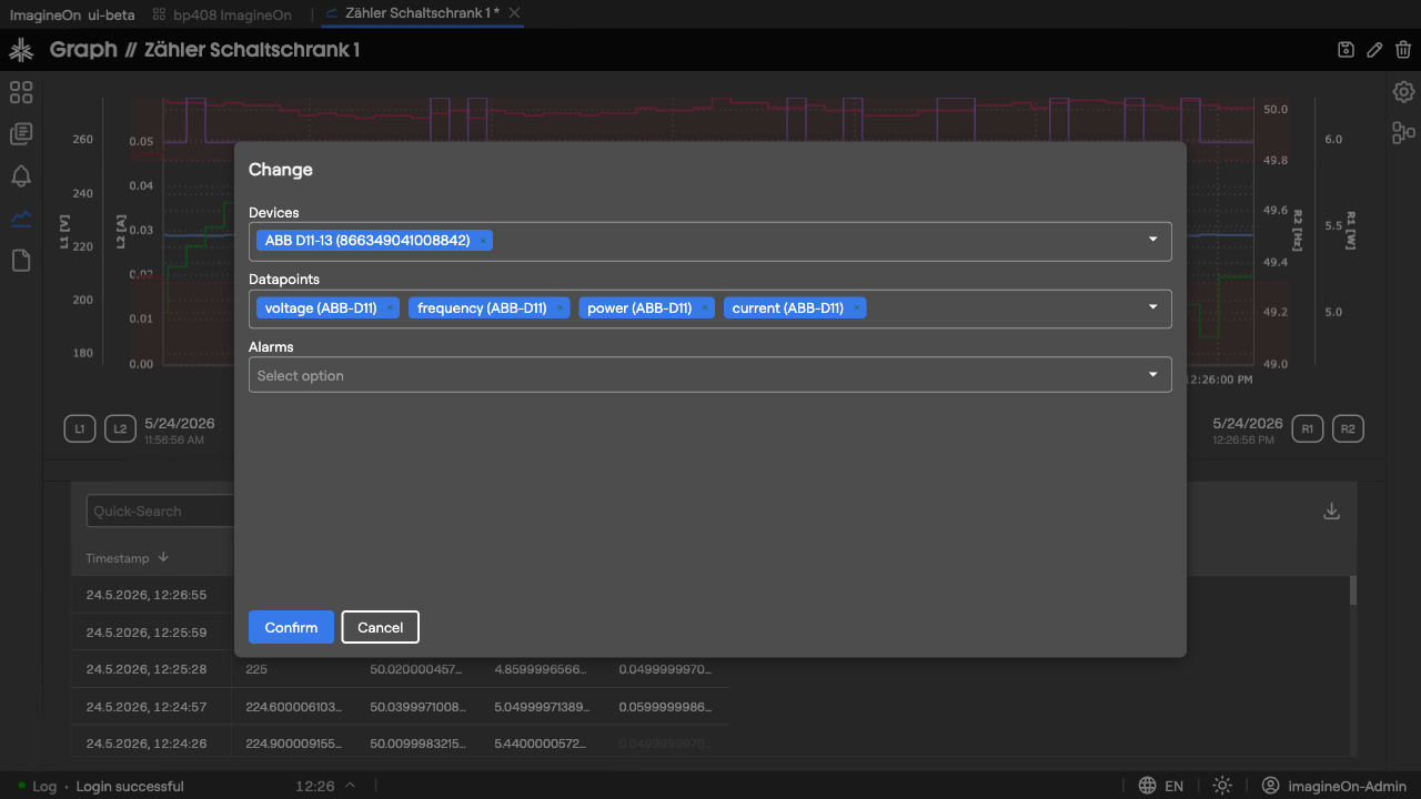
The dialog has three multi-selects:
- Devices — pick one or more devices to pull data from.
- Datapoints — choose which datapoints (properties) of those devices to plot. Numeric datapoints become line series on the main chart; bool and enum datapoints become colored state bands in the strip just below the chart.
- Alarms — optionally add alarms (watchers) to annotate the chart with bands marking the periods when each alarm was active.
Click Confirm to apply. The chart reloads for the current time range. Re-open the dialog at any time to add or remove entries — your existing axis assignments and overlays are preserved where they still make sense.
Tip: When you add a datapoint that has the same unit as one already on the chart, the new series is auto-assigned to the matching axis instead of creating a new one.
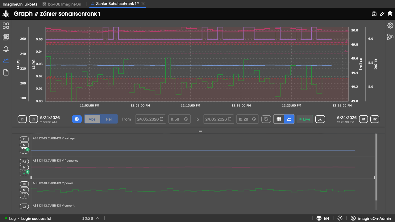
2. Time range and Live mode
Choosing a range
Use the Abs / Rel toggle to pick how you want to specify the window:
- Absolute — pick exact From and To dates and times.
- Relative — pick a preset interval ending "now": 30m, 1h, 6h, 12h, 24h, 3D, 7D, 14D.
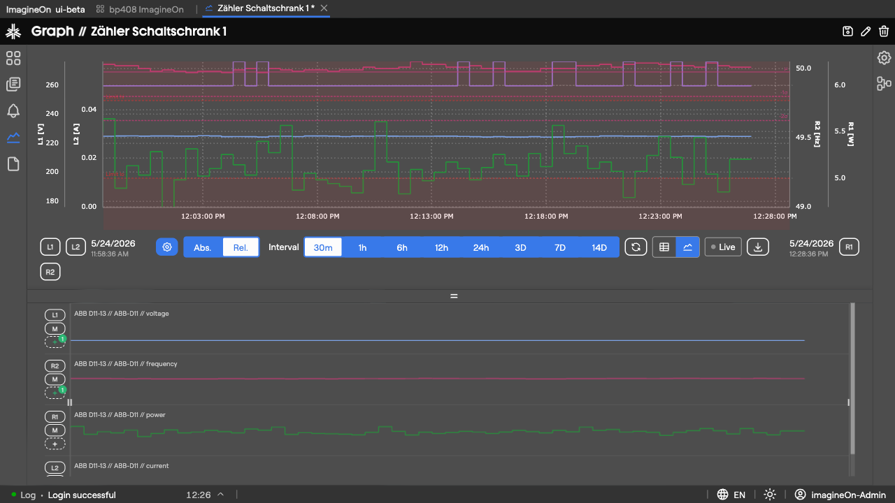
After changing the range, click Update to (re-)fetch data. Large windows are split into smaller chunks under the hood and fetched in parallel, so wide queries stay responsive.
Live mode
Click Live to switch on real-time updates.
While Live is on:
- The window's right edge tracks "now" — it advances every second.
- New values from the backend WebSocket are appended to each series as they arrive.
- The time picker, Update button and From / To fields are locked. Hover the lock indicator for an explanation.
- The Live button shows a green pulsing dot.
If you change the time range, Live mode turns off automatically. If you leave the tab and come back, you may be asked whether to resume Live where you left off (tick Don't show again to suppress the prompt — your preference is stored per user).
3. Y-axes: assigning, editing, panning
Every numeric series sits on a Y-axis. Axes are numbered per side: L1, L2, … on the left and R1, R2, … on the right. By default a new property goes onto L1.
Reassigning a series
In the sparkline panel, each lane has a small axis badge showing the current axis (e.g. L1).
| Gesture | Effect |
|---|---|
| Click the badge | Cycle to the next axis (L1 → L2 → R1 → R2 → L1 …). |
| Shift-click on the highest existing axis | Create a new axis group on the opposite side. |
| Right-click | Remove the series from its axis (and from the chart). |
Editing axis range
Click an L1 / R1 / … button in the toolbar to open the axis editor.
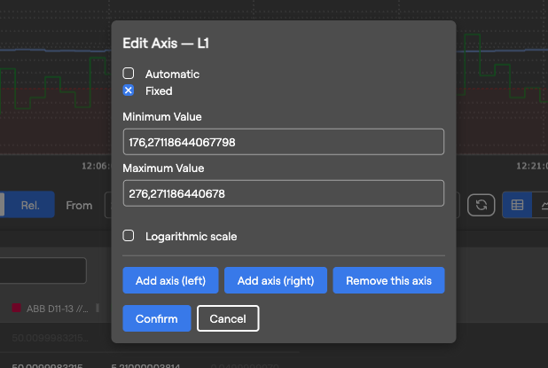
- Automatic — axis range follows the data (with ~5 % padding).
- Fixed — enter explicit Minimum Value and Maximum Value. Tick Logarithmic scale for log axes.
- Add axis (left) / Add axis (right) — create a fresh axis group on either side and move the current series to it.
- Remove this axis — drop the axis (and unassign series that lived on it).
- Confirm to apply, Cancel to discard.
Drag-to-pan
Press and drag inside the left or right axis margin of the chart (cursor turns to ↕). This scrolls the axis range up or down without changing zoom. Useful when you want to see what's just above or below the current view.
4. The sparkline panel
Switch the bottom panel to Sparklines with the toolbar toggle.
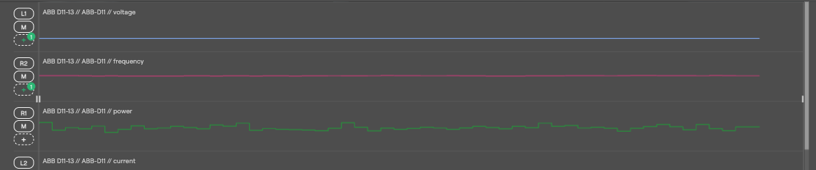
Each property gets its own row containing:
- Axis badge — see §3.
- Mute (M) button — temporarily hide this series on the main chart without removing it. Click again to show.
- Overlay (dashed +) button — opens the Overlay Editor for this series (§6).
- Mini-chart — decimated preview of the full data range, in the series' own color.
Range slider
Below the sparklines is a range slider spanning the full requested time range:
- Drag the left handle to move the window start.
- Drag the right handle to move the window end.
- Drag the middle band to pan both handles together (keeps the window width constant).
The main chart updates as you drag.
5. The table panel
Switch the bottom panel to Table.
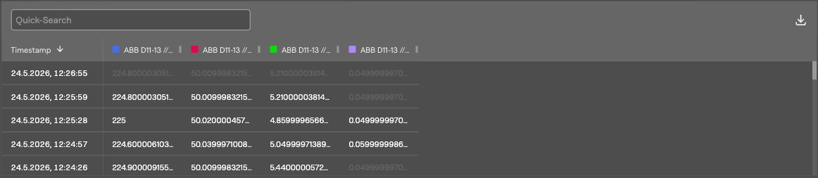
Columns:
- Timestamp (pinned left). Click a row to mark that timestamp on the main chart with a crosshair.
- One column per visible property, header colored to match the chart series.
Interpolated values (cells that were filled in because the source had a gap) are styled differently from raw values. Bool and enum cells show the human-readable state name, not the underlying number.
A CSV export button in the table toolbar saves the table contents (timestamps + visible properties) to a file (graph-YYYY-MM-DD-HH-MM-SS.csv). See Sharing & Persistence.
6. Overlays: thresholds, ranges, statistics
Overlays are visual annotations drawn on top of a series. To add or edit overlays for a property, click its dashed + button in the sparkline panel.
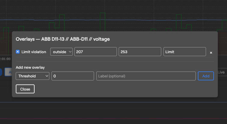
Pick an overlay Kind from the dropdown, fill in the fields and click Add. Existing overlays appear in a list below — each can be edited, toggled on/off, or removed.
| Kind | Renders as | Typical use |
|---|---|---|
| Threshold | Dashed horizontal line at the given value. | "Don't exceed 60 °C" reminder. |
| Target | Solid horizontal line. | A target setpoint to compare against. |
| Min / Max | Two dashed lines at the dataset's min and max. | Quick eyeballing of the current range. |
| Hysteresis | Filled band between Lower and Upper, with dashed boundary lines. | The dead-band of a controller. |
| Limit violation | Filled region marking values outside a chosen operator / threshold. | Highlight when a value goes above/below an unsafe limit. |
| Standard deviation | Center line at μ, dashed lines at ±σ (1–4 σ, configurable). | Identify outliers around the mean. |
| Trend | Ghost line series. | (reserved) |
| Time shift | Same series shifted by a preset (1 h / 1 d / 1 w) or custom offset. | (reserved) |
For computed overlays (Min/Max, Standard deviation), the modal also displays the underlying numbers read-only so you can sanity-check before adding.
7. State bands and alarm annotations
Bool and enum properties don't make sense as line series — they're rendered as colored bands in a strip directly below the main chart:
- Each band spans the time interval during which the state held a particular value.
- Hover a band to see its state name and time range.
- Multiple state-typed properties get stacked rows in the strip.
Alarms added via the settings dialog become vertical annotation bands on the chart, marking the periods during which the alarm was active.